Finding the Right Policy
CoverHound is an Insurtech leader offering digital shoppers curated comparisons of insurance options for small businesses owners.
Background: In company efforts to increase the number of online policies purchased, we looked at the funnel and noticed higher drop-off rates on key conversion pages for shoppers who can purchase at least 1 policy online. Considering recent benchmark tests, potential for sale conversion, and overall effort vs. impact - we decided to spend 1.5 months redesigning the Quote Compare page.
Problem: How might we help busy small business owners confidently select a quote?
Success Metric:
Decreased drop-off rates on the Quote Compare page
Increased # of online policies purchased
Timeline: 1.5 months
Role: Lead Product designer on cross-functional team with a PM, Engineer, and UX Researcher to produce designs for both desktop and mobile experiences.
Tasks include:
Competitive / Comparative Analysis
User Research
Wireframing
Usability Testing
Hi-Fi Designs
Micro-Animations
Initial Research
Based on previous benchmark test for this Quote Compare page, interviewing small business owners, and running surveys, we found:
77% of users are shopping for insurance for the first time
Users found it difficult to compare insurers in its current layout. Other than price, it was difficult to see the benefits of selecting one carrier over another.
Users needed more information coverages and carriers (i.e. Customer Reviews? Price Breakdown? Ability to change limits? etc).
Users weigh out pricing with additional coverages
These were all helpful in understanding their mindset and context. However, we also wanted to perform a page audit on our current and competitive/comparative analysis to understand how this page compares.
Key Takeaways:
Side-by-side is a familiar comparison framework
Balancing the amount of information will be important - they need to be informed but too much can be overwhelming
Business owners are busy - so how can we give them the confidence to select a quote
Narrowing Scope
In addition to the running list of feature ideas that came from this research, our team was also receiving requests from leadership. So, we decided to create an MVP / Post-MVP Checklist to keep us in scope.
Post-MVP
❌ Custom Limits
❌ Customer Review
❌ Carrier Claims Information
MVP
✅ New Layout
✅ Tooltips on Coverages
✅ Carrier Info
Design & Iteration
After sketching out a few options, we wanted to do an initial layout usability test to understand what layout and display of information made most sense to the user.
Test Success Metrics:
Avg. confidence rating > 4 out of 5
Preference of 70% or more for one version
Layout Usability Test Learnings:
70% preferred the Proposed experience
Avg. confidence rating for Proposed version was 4.6 out of 5
Based on these numbers and the testers comments, we decided to move forward with this side-by-side layout. We were curious about how presentation of coverage details so we performed a usability and preference test for the coverages design.
Here were the two layouts we tested:
Analysis:
Newer layout was easier to scan information
Clearer in providing information about carriers
Definitions for coverages were helpful
Now that we were more confident in overall direction, we moved on to high-fidelity designs. After a few rounds of design explorations - sharing it with our internal project team, design team, and leadership, we decided on this final design.
Final Product
Press: Coverager
The Full Experience - Loading State
The main page was done but we also had to consider the full experience - which includes the time it takes from application submission to this quote page.
Considerations:
User could get this “successful” quote page OR potentially no quote
Carrier quote return times vary and can take up to 1m 45s
Since the quote results & time could vary, we decided on two different loading states to occur at the two points below:
Also, knowing that these users are new to shopping for business insurance, I wanted to make sure we were transparent in our messaging of what we were doing, and set expectations for types of results they will receive. This is the final progression of the loading screens:
Results
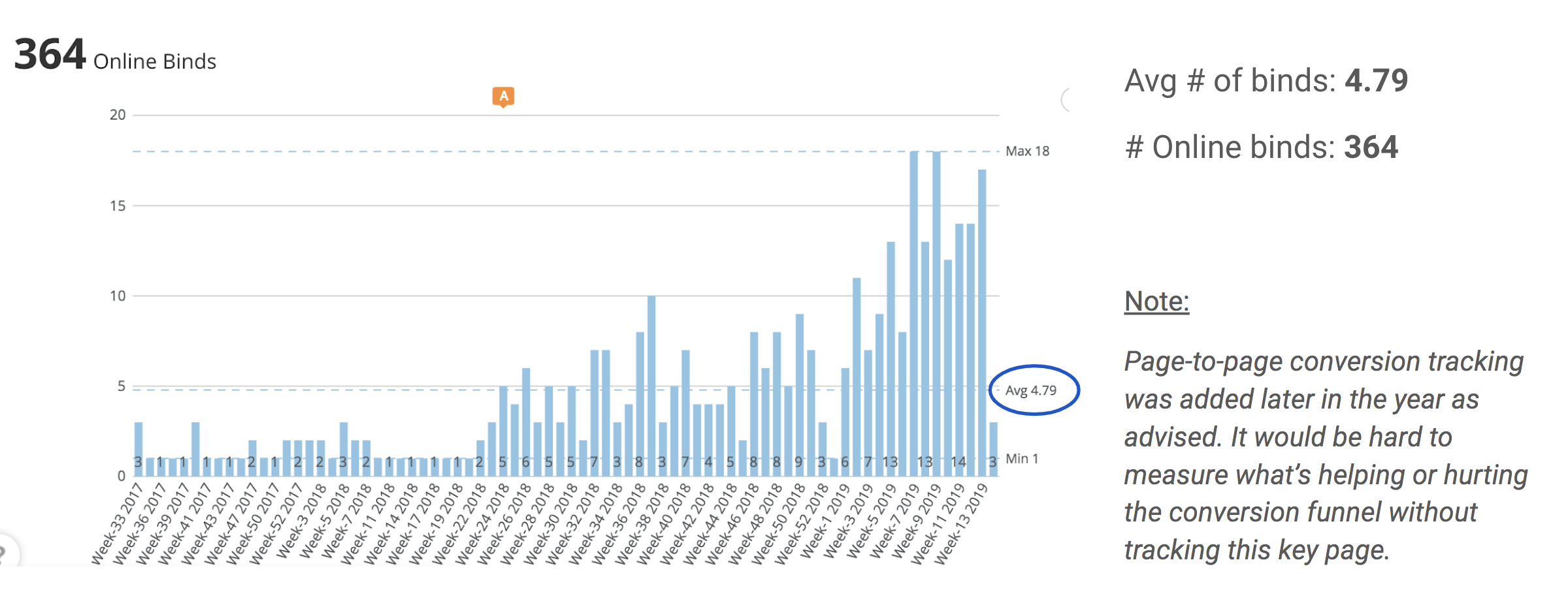
Pre-Launch Data:
We were unable to collect page-to-page conversion at the time because of the previous page implementation, however - our team decided to look at the total # of online binds to gauge success of feature.
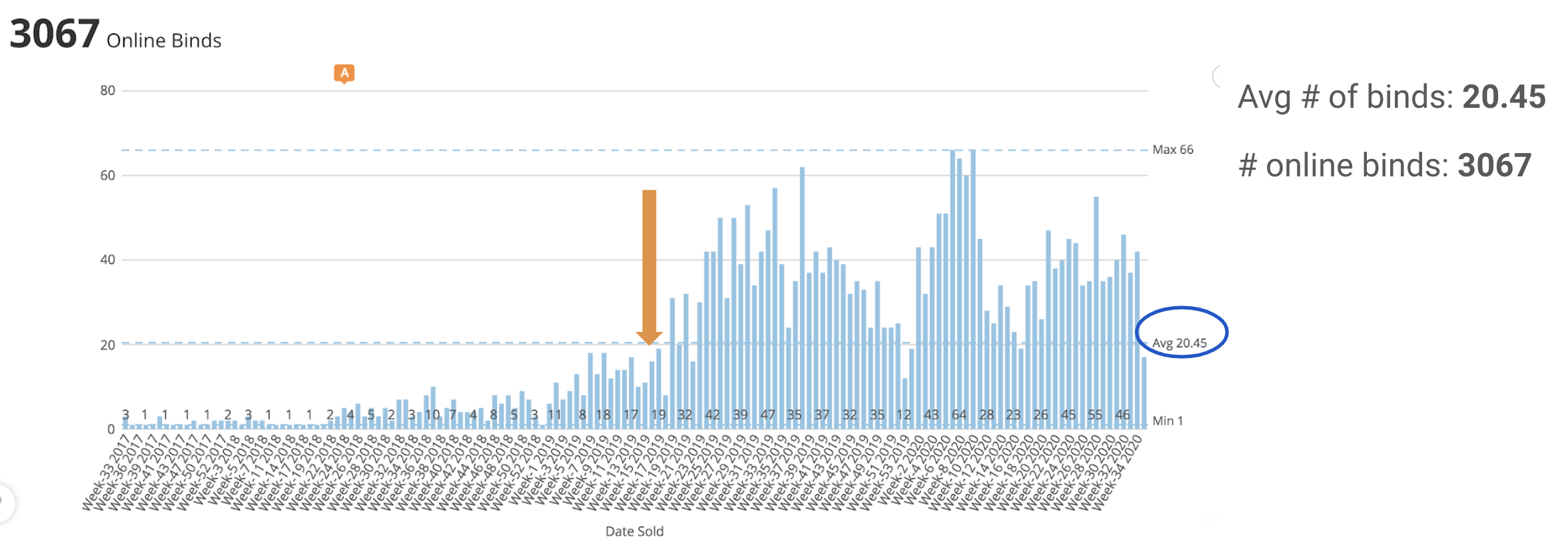
Post-Launch Data:
We more than doubled our numbers post-launch! This could be due to a variety of factors and efforts from other teams, but confidence from our research and the upward trend shows positive contribution. This feature is currently in production.
Next Steps
Improve the mobile experience
Customization of limits - our insurance agents have mentioned businesses asking about this. It can be a helpful tool for users in addition to our agents
Follow-up Research to see if there is anything else we can uncover post-launch through a benchmark test and/or surveys.


